Compose by example: BoxWithConstraints
November 18, 2022

BoxWithConstraints Composable lets us build adaptive layouts based on available height/width and other constraints. This post will provide an example when it can be useful.
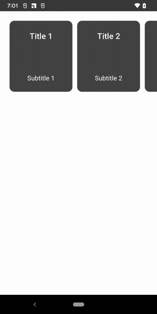
Let’s imagine our Designer is asking to build a horizontal carousel with the following requirements:
in portrait mode, 2 cards are fully visible and an additional one is peeking letting users know that there is more content to scroll through
in landscape mode, 4 cards are fully visible and an additional one is peeking letting users know that there is more content to scroll through
To visualize this layout and behavior:

Since BoxWithConstraints gives us access to maxWidth and maxHeight, we can:
Figure out if we are currently in portrait or landscape mode
Calculate width of each card based on available screen width also taking into consideration that one card should be peeking (partially visible)
Let’s see the code:
BoxWithConstraints {
  val boxWithConstraintsScope = this
  LazyRow(
    horizontalArrangement = Arrangement.spacedBy(12.dp),
    verticalAlignment = Alignment.CenterVertically,
    contentPadding = PaddingValues(24.dp)
  ) {
    items(cardData) { card ->
      if (boxWithConstraintsScope.maxWidth > maxHeight) {
        // in landscape mode
        val cardWidth = boxWithConstraintsScope.maxWidth / 4
        MyCard(
          title = card.first,
          subtitle = card.second,
          height = boxWithConstraintsScope.maxHeight / 3,
          width = cardWidth - cardWidth * 0.15f
        )
      } else {
        // in portrait mode
        val cardWidth = boxWithConstraintsScope.maxWidth / 2
        MyCard(
          title = card.first,
          subtitle = card.second,
          height = boxWithConstraintsScope.maxHeight / 4,
          width = cardWidth - cardWidth * 0.2f
        )
      }
    }
  }
}
We can clean this up by creating an intermediate Composable scoped to BoxWithConstraintsScope: and use maxWidth and maxHeight without specifying scope every time.
@Composable
fun BoxWithConstraintsScope.AdaptiveLayoutCardList(cardData: List<Pair<String, String>>) {
  LazyRow(
    horizontalArrangement = Arrangement.spacedBy(12.dp),
    verticalAlignment = Alignment.CenterVertically,
    contentPadding = PaddingValues(24.dp)
  ) {
    items(cardData) { card ->
      if (maxWidth > maxHeight) {
        // in landscape mode
        val cardWidth = maxWidth / 4
        MyCard(
          title = card.first,
          subtitle = card.second,
          height = maxHeight / 3,
          width = cardWidth - cardWidth * 0.15f
        )
      } else {
        // in portrait mode
        val cardWidth = maxWidth / 2
        MyCard(
          title = card.first,
          subtitle = card.second,
          height = maxHeight / 4,
          width = cardWidth - cardWidth * 0.2f
        )
      }
    }
  }
}
And calling it like so:
setContent {
  BoxWithConstraintsDemoTheme {
    val cardData = remember { generateCards() }

    BoxWithConstraints {
      AdaptiveLayoutCardList(cardData)
    }
  }
}
To summarize, BoxWithConstraints is similar to Box but gives us access to boxWithConstraintsScope that can help us analyze parent dimensions and available constraints to help you decide what content to display or how to lay it out.
Note that we calculate cardWidth based on boxWithConstraintsScope.maxWidth but boxWithConstraintsScope also provides access to these properties:

Affect on Compose phases
As a reminder, normally the order of Jetpack Compose phases is:
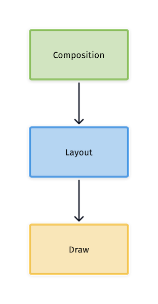
However, when BoxWithConstraints is used, these phases are affected as follows:
The Composition phase is deferred until the Layout phase until the constraints and dimensions are known
More work is done in the Layout phase which may be noticeable, especially in complex layouts
boxWithConstraintsScope makes it easy to figure if we are in landscape or portrait mode just by comparing width and height:
if (maxWidth > maxHeight) {
  // in landscape
} else {
  // in portrait mode
}
A more verbose alternative to determine the orientation would be LocalConfiguration.
val configuration = LocalConfiguration.current

when (configuration.orientation) {
  Configuration.ORIENTATION_LANDSCAPE -> {
    // in landscape mode
  }
  else -> {
    // in portrait mode
  }
}
In this case, since we are already using BoxWithConstraints, using LocalConfiguration is unnecessary.
Full source for this example is below as well as at https://github.com/jshvarts/BoxWithConstraintsDemo
class MainActivity : ComponentActivity() {
  override fun onCreate(savedInstanceState: Bundle?) {
    super.onCreate(savedInstanceState)
    setContent {
      BoxWithConstraintsDemoTheme {
        Surface(modifier = Modifier.fillMaxSize(), color = MaterialTheme.colors.background) {
          val cardData = remember { generateCards() }

          BoxWithConstraints {
            AdaptiveLayoutCardList(cardData)
          }
        }
      }
    }
  }
}

@Composable
fun BoxWithConstraintsScope.AdaptiveLayoutCardList(cardData: List<Pair<String, String>>) {
  LazyRow(
    horizontalArrangement = Arrangement.spacedBy(12.dp),
    verticalAlignment = Alignment.CenterVertically,
    contentPadding = PaddingValues(24.dp)
  ) {
    items(cardData) { card ->
      if (maxWidth > maxHeight) {
        // in landscape mode
        val cardWidth = maxWidth / 4
        MyCard(
          title = card.first,
          subtitle = card.second,
          height = maxHeight / 3,
          width = cardWidth - cardWidth * 0.15f
        )
      } else {
        // in portrait mode
        val cardWidth = maxWidth / 2
        MyCard(
          title = card.first,
          subtitle = card.second,
          height = maxHeight / 4,
          width = cardWidth - cardWidth * 0.2f
        )
      }
    }
  }
}

@Composable
fun MyCard(
  title: String,
  subtitle: String,
  height: Dp,
  width: Dp
) {
  Card(
    shape = RoundedCornerShape(12.dp),
    modifier = Modifier
      .height(height)
      .width(width)
  ) {
    Column(
      verticalArrangement = Arrangement.SpaceBetween,
      horizontalAlignment = Alignment.CenterHorizontally,
      modifier = Modifier
        .background(Color.DarkGray)
        .padding(24.dp)
    ) {
      Text(
        text = title,
        color = Color.White,
        style = MaterialTheme.typography.h6,
        textAlign = TextAlign.Center
      )
      Text(
        text = subtitle,
        color = Color.White,
        style = MaterialTheme.typography.subtitle1,
        textAlign = TextAlign.Center
      )
    }
  }
}

private fun generateCards(): List<Pair<String, String>> {
  return MutableList(20) { index ->
    val cardNumber = index + 1
    "Title $cardNumber" to "Subtitle $cardNumber"
  }
}

@Preview(showBackground = true)
@Composable
fun MyCardPreview(
  title: String = "Title 1",
  subtitle: String = "Subtitle 1",
  height: Dp = 80.dp,
  width: Dp = 60.dp
) {
  BoxWithConstraintsDemoTheme {
    MyCard(
      title = title,
      subtitle = subtitle,
      height = height,
      width = width
    )
  }
}