Compose Row, Column and Scoped Modifiers
March 28, 2022

Let’s talk about building layouts in Compose using Row and Column composables. On the agenda:
Basic usage
Arrangement
Alignment
Scoped Modifiers (RowScope and ColumnScope)
Chaining Modifiers
Scoping composables
Basic Usage
Row and Column Composables are similar to LinearLayout in View system with orientation of “horizontal” and “vertical” respectively.
Row lays out elements horizontally in a row:
Row {
    Text(
        text = "One",
        fontSize = 48.sp,
        modifier = Modifier
            .background(Color.Yellow)
    )
    Text(
        text = "Two",
        fontSize = 48.sp,
        modifier = Modifier
            .background(Color.Green)
    )
    Text(
        text = "Three",
        fontSize = 48.sp,
        modifier = Modifier
            .background(Color.Cyan)
    )
}
The code above will draw the following UI:

Column lays out elements vertically in a column:
Column {
    Text(
        text = "One",
        fontSize = 48.sp,
        modifier = Modifier
            .background(Color.Yellow)
    )
    Text(
        text = "Two",
        fontSize = 48.sp,
        modifier = Modifier
            .background(Color.Green)
    )
    Text(
        text = "Three",
        fontSize = 48.sp,
        modifier = Modifier
            .background(Color.Cyan)
    )
}
Resulting in the following UI:

Arrangement
Arrangement refers to arranging elements along the main axis (in the case of a Row, the main axis is X or horizontal and in the case of a Column the main axis is Y or vertical).
Since Row supports horizontal arrangement, you can specify the type of horizontalArrangement in the constructor:
Row(horizontalArrangement = Arrangement.Center) {
    Text(
        text = "One",
        fontSize = 48.sp,
        modifier = Modifier
            .background(Color.Yellow)
    )
    Text(
        text = "Two",
        fontSize = 48.sp,
        modifier = Modifier
            .background(Color.Green)
    )
    Text(
        text = "Three",
        fontSize = 48.sp,
        modifier = Modifier
            .background(Color.Cyan)
    )
}
Which will arrange the elements in the center of the available space.

Column refers to a vertical arrangement of elements. Therefore, it’s logical that you are able to specify verticalArrangement in its constructor:
Column(verticalArrangement = Arrangement.Center) {
    Text(
        text = "One",
        fontSize = 48.sp,
        modifier = Modifier
            .background(Color.Yellow)
    )
    Text(
        text = "Two",
        fontSize = 48.sp,
        modifier = Modifier
            .background(Color.Green)
    )
    Text(
        text = "Three",
        fontSize = 48.sp,
        modifier = Modifier
            .background(Color.Cyan)
    )
}
Which will place the elements in the center of the column parent:

A great visual summary of available Arrangement values for rows and columns can be found here.
Alignment
In addition to arrangement, when using a Row one can specify verticalAlignment in the constructor to control how the elements in the Row are laid out:
Row(verticalAlignment = Alignment.CenterVertically) {
    Text(
        text = "One",
        fontSize = 48.sp,
        modifier = Modifier
            .background(Color.Yellow)
    )
    Text(
        text = "Two",
        fontSize = 48.sp,
        modifier = Modifier
            .background(Color.Green)
    )
    Text(
        text = "Three",
        fontSize = 48.sp,
        modifier = Modifier
            .background(Color.Cyan)
    )
}
Which will center the row children vertically:

When using a Column one can specify horizontalAlignment in the constructor to control how the elements in the Column are laid out:
Column(horizontalAlignment = Alignment.CenterHorizontally) {
    Text(
        text = "One",
        fontSize = 48.sp,
        modifier = Modifier
            .background(Color.Yellow)
    )
    Text(
        text = "Two",
        fontSize = 48.sp,
        modifier = Modifier
            .background(Color.Green)
    )
    Text(
        text = "Three",
        fontSize = 48.sp,
        modifier = Modifier
            .background(Color.Cyan)
    )
}
Which will center the column children vertically:

And, of course, often you combine arrangement and alignment parameters when working with rows and columns:
Column(
  verticalArrangement = Arrangement.Center,
  horizontalAlignment = Alignment.CenterHorizontally
) {
    Text(text = "One")
    Text(text = "Two")
}
RowScope
When you create a Row, you get access to the content lambda receiver is a RowScope gaining more control over placement of the children of Row.
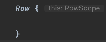
To help you visualize RowScope, here is Row function signature in androidx.compose.foundation:
@Composable
inline fun Row(
    modifier: Modifier = Modifier,
    horizontalArrangement: Arrangement.Horizontal = Arrangement.Start,
    verticalAlignment: Alignment.Vertical = Alignment.Top,
    content: @Composable RowScope.() -> Unit
)
RowScope defines some Modifier functions applicable to rows.
Modifier.weight
Modifier.align
Modifier.alignBy
Modifier.alignByBaseline
Let’s look at an example of how Modifier.alignByBaseline() can be useful. Assume you have a row of texts of different sizes:
Row {
    Text(
        text = "One",
        fontSize = 48.sp,
        modifier = Modifier
            .background(Color.Yellow)
    )

    Text(
        text = "Two",
        fontSize = 24.sp,
        modifier = Modifier
            .background(Color.Green)
    )
    Text(
        text = "Three",
        fontSize = 16.sp,
        modifier = Modifier
            .background(Color.Cyan)
    )
}
This will produce the following UI:

RowScope’s Modifier.alignByBaseline() allows us to align all Text elements inside this Row by baseline:
Row {
    Text(
        text = "One",
        fontSize = 48.sp,
        modifier = Modifier
            .background(Color.Yellow)
            .alignByBaseline()
    )

    Text(
        text = "Two",
        fontSize = 24.sp,
        modifier = Modifier
            .background(Color.Green)
            .alignByBaseline()
    )
    Text(
        text = "Three",
        fontSize = 16.sp,
        modifier = Modifier
            .background(Color.Cyan)
            .alignByBaseline()
    )
}
Which will align all “participating” texts to the same baseline:

If any of the sibling Texts is not participating in this Modifier function, its baseline won’t be aligned to the rest of the Text composables. Observe what happens to Text “Three”:
Row {
    Text(
        text = "One",
        fontSize = 48.sp,
        modifier = Modifier
            .background(Color.Yellow)
            .alignByBaseline()
    )

    Text(
        text = "Two",
        fontSize = 24.sp,
        modifier = Modifier
            .background(Color.Green)
            .alignByBaseline()
    )
    Text(
        text = "Three",
        fontSize = 16.sp,
        modifier = Modifier
            .background(Color.Cyan)
    )
}
Resulting in the following:

Let’s look at another useful RowScope Modifier function, weight()
Row {
    Text(
        text = "One",
        fontSize = 48.sp,
        modifier = Modifier
            .background(Color.Yellow)
            .alignByBaseline()
            .weight(weight = 2f)
    )

    Text(
        text = "Two",
        fontSize = 24.sp,
        modifier = Modifier
            .background(Color.Green)
            .alignByBaseline()
            .weight(weight = 4f)
    )
    Text(
        text = "Three",
        fontSize = 16.sp,
        modifier = Modifier
            .background(Color.Cyan)
            .alignByBaseline()
            .weight(weight = 1f)
    )
}
Given the weight values, Text “Two” gets the the largest space proportionally:

ColumnScope
When you create a Column, the content lambda receiver is a ColumnScope which gives you more control over placement of the children of Column:

To help you visualize ColumnScope, here is Column function signature in androidx.compose.foundation:
@Composable
inline fun Column(
    modifier: Modifier = Modifier,
    verticalArrangement: Arrangement.Vertical = Arrangement.Top,
    horizontalAlignment: Alignment.Horizontal = Alignment.Start,
    content: @Composable ColumnScope.() -> Unit
)
ColumnScope supports the following Modifier functions (note that alignByBaseline() does not apply here as it would not make sense laying out elements of a Column):
Modifier.weight
Modifier.align
Modifier.alignBy
We are not going to cover these in detail, by given the RowScope examples, these should be intuitive enough to explore on your own.
Chaining Modifiers
Sometimes it’s helpful to chain Modifiers. For instance, we can have a custom composable to describe our Text and then affect its placement within a RowScope by passing another Modifier in.
@Composable
fun MyText(
    text: String,
    modifier: Modifier = Modifier,
    fontSize: TextUnit = 16.sp
) {
    val textModifier = Modifier
        .border(width = 2.dp, color = Color.Black)

    Text(
        text = text,
        fontSize = fontSize,
        textAlign = TextAlign.Center,
        modifier = textModifier.then(modifier)
    )
}
And use it in a RowScope:
Row {
    MyText(
        text = "One",
        fontSize = 48.sp,
        modifier = Modifier
            .background(Color.Yellow)
            .alignByBaseline()
            .weight(weight = 2f)
    )
    MyText(
        text = "Two",
        fontSize = 24.sp,
        modifier = Modifier
            .background(Color.Green)
            .alignByBaseline()
            .weight(weight = 4f)
    )
    MyText(
        text = "Three",
        modifier = Modifier
            .background(Color.Cyan)
            .alignByBaseline()
            .weight(weight = 1f)
    )
}
In this scenario, besides affecting the border of the Text, we are controlling background, baseline alignment, and weight by passing in an extra modifier.
Note that we chain modifiers using modifierA.then(modifierB) . The order is important: modifierA will be applied first followed by modifierB. Switching places will often result in differences in UI.
Scoping composables
We can improve the example above by scoping our composable MyText to the RowScope to gain access to modifiers applicable specifically to RowScope. This way some of the common Modifier functions can be applied by default to reduce boilerplate.
@Composable
fun RowScope.MyText(
    text: String,
    modifier: Modifier = Modifier,
    fontSize: TextUnit = 16.sp
) {
    val textModifier = Modifier
        .border(width = 2.dp, color = Color.Black)
        .alignByBaseline()

    Text(
        text = text,
        fontSize = fontSize,
        textAlign = TextAlign.Center,
        modifier = textModifier.then(modifier)
    )
}
And use it from Row: without having to .applyByBaseline() for each instance of MyText. Both will produce the same UI.
Row {
    MyText(
        text = "One",
        fontSize = 48.sp,
        modifier = Modifier
            .background(Color.Yellow)
            .weight(weight = 2f)
    )
    MyText(
        text = "Two",
        fontSize = 24.sp,
        modifier = Modifier
            .background(Color.Green)
            .weight(weight = 4f)
    )
    MyText(
        text = "Three",
        modifier = Modifier
            .background(Color.Cyan)
            .weight(weight = 1f)
    )
}
Both examples above produce the same result:

Another example of scoping, this time to a ColumnScope, is shown below:
@Composable
fun ColumnScope.MyText(
    text: String,
    modifier: Modifier = Modifier,
) {
    Text(
        modifier = modifier.align(Alignment.CenterHorizontally),
        text = text
    )
}
and then use it with:
Column {
    MyText(text = "One")
}
Also, here is an example of creating a reusable MyButton component with a content lambda as a parameter in a ColumnScope so we can use a weight modifier:
@Composable
fun ColumnScope.MyButton(
    onClick: () -> Unit,
    content: @Composable RowScope.() -> Unit
) {
    Button(
        onClick = onClick,
        modifier = Modifier.weight(5f),
        content = content
    )
}