Using MotionLayout in Compose
May 5, 2022
MotionLayout has been a big part of Android development for a couple of years now. It is a subset of ConstraintLayout that lets you manage motion and widget animation. It’s getting incorporated into Jetpack Compose as well and while in experimental stage and limited, it can already be a very powerful tool in your toolkit.
MotionLayout in Compose
In this blog post we will go over an example of using MotionLayout in Jetpack Compose by animating a several widgets in relation to each other.
First, make sure you have this dependency added in your application module (motion layout is a part of constraint layout):
implementation "androidx.constraintlayout:constraintlayout-compose:1.0.0"
Here is a framework code for MotionLayout composable:
@ExperimentalMotionApi
@Composable
inline fun MotionLayout(
    motionScene: MotionScene,
    progress: Float,
    debug: EnumSet<MotionLayoutDebugFlags> = EnumSet.of(MotionLayoutDebugFlags.NONE),
    modifier: Modifier = Modifier,
    optimizationLevel: Int = Optimizer.OPTIMIZATION_STANDARD,
    crossinline content: @Composable (MotionLayoutScope.() -> Unit),
)
Note the @ExperimentalMotionApi annotation. At this time, any composable that uses MotionLayout should opt into this experimental API using annotation @OptIn(ExperimentalMotionApi::class)
Let’s create MotionScene by passing the string contents of the JSON5 file defining our motion scene.
val context = LocalContext.current
val motionSceneContent = remember {
    context.resources
        .openRawResource(R.raw.motion_scene)
        .readBytes()
        .decodeToString()
}
MotionLayout(
    motionScene = MotionScene(motionSceneContent),
    progress = progress,
    modifier = Modifier
        .fillMaxWidth(),
) {
}
The app/src/main/res/raw/option_scene.json5 file contains:
{
  ConstraintSets: {
    start: {
      my_divider: {
        start: ['parent', 'start', 64],
        end: ['parent', 'end']
      }
    },
    end: {
      my_divider: {
        start: ['parent', 'start'],
        end: ['parent', 'end', 64]
      }
    }
  }
}
Note that we start off having 64px space to the left of the divider but when we finish animating, we end up with a the 64px space to the right of the divider.
Also note that we named our divider widget my_divider to make it clear that the name is completely arbitrary. The start and end attributes inside the divider element are defining how the divider will be positioned relative to the parent container.
As an alternative to creating MotionScene based on a JSON5 file placed into the raw folder, we could define constraint sets in code like below. However, I believe that would quickly result in code that is harder to maintain. The JSON file provides a better separation of concern and is easier to edit while maintaining proper formatting.
MotionLayout(
    motionScene = MotionScene(
    """
    {
        ConstraintSets: {
            start: {
                my_divider: {
                    start: ['parent', 'start', 64],
                    end: ['parent', 'end']
                }
            },
            end: {
                my_divider: {
                    start: ['parent', 'start'],
                    end: ['parent', 'end', 64]
                }
            }
       }
  }
  """
)
And finally we can set up our MotionLayout:
@OptIn(ExperimentalMotionApi::class)
@Composable
fun MyMotionLayout(progress: Float) {
    val context = LocalContext.current
    val motionSceneContent = remember {
        context.resources
            .openRawResource(R.raw.motion_scene)
            .readBytes()
            .decodeToString()
    }
    MotionLayout(
        motionScene = MotionScene(motionSceneContent),
        progress = progress,
        modifier = Modifier
            .fillMaxWidth(),
    ) {
        Divider(
            color = Color.Gray,
            thickness = 2.dp,
            modifier = Modifier
                .layoutId("my_divider")
        )
    }
}
We connect the divider in the motion scene file to the Divider composable using layoutId
We will use a Slider composable to control the animation progress. progress is a value between 0f and 1f

Here is the entire code including setting up a slider to pass progress to be used by our motion layout:
class MainActivity : ComponentActivity() {
    override fun onCreate(savedInstanceState: Bundle?) {
        super.onCreate(savedInstanceState)
        setContent {
            MotionLayoutComposeDemoTheme {
                Column(
                    verticalArrangement = Arrangement.SpaceEvenly,
                    modifier = Modifier
                        .fillMaxSize()
                ) {
                    var progress by remember {
                        mutableStateOf(0f)
                    }
                    MyMotionLayout(progress = progress)
                    Slider(
                        value = progress,
                        onValueChange = {
                            progress = it
                        },
                        modifier = Modifier
                            .padding(horizontal = 32.dp)
                    )
                }
            }
        }
    }
}

@OptIn(ExperimentalMotionApi::class)
@Composable
fun MyMotionLayout(progress: Float) {
    val context = LocalContext.current
    val motionSceneContent = remember {
        context.resources
            .openRawResource(R.raw.motion_scene)
            .readBytes()
            .decodeToString()
    }
    MotionLayout(
        motionScene = MotionScene(motionSceneContent),
        progress = progress,
        modifier = Modifier
            .fillMaxWidth(),
    ) {
        Divider(
            color = Color.Gray,
            thickness = 2.dp,
            modifier = Modifier
                .layoutId("my_divider")
        )
    }
}

@Preview(showBackground = true)
@Composable
fun MyMotionLayoutPreview() {
    MotionLayoutComposeDemoTheme {
        MyMotionLayout(1F)
    }
}
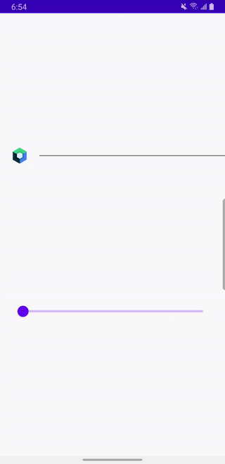
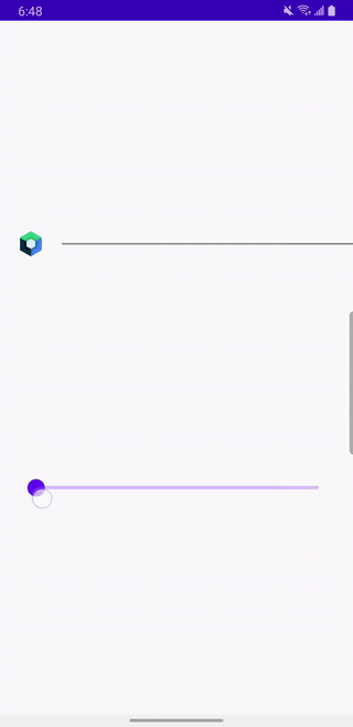
This will draw and animate our Divider as we drag the Slider:
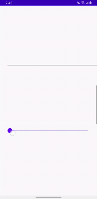
Add Image
Let’s add an image (Jetpack Compose logo) to the mix. It will initially appear to the left of the divider and as we scroll the slider, it will move to the end of the slider:
{
  ConstraintSets: {
    start: {
      my_image: {
        width: 40,
        height: 40,
        start: ['parent', 'start', 16]
      },
      my_divider: {
        start: ['my_image', 'end', 16],
        top: ['my_image', 'top'],
        bottom: ['my_image', 'bottom']
      }
    },
    end: {
      my_image: {
        width: 40,
        height: 40,
        end: ['parent', 'end', 16]
      },
      my_divider: {
        end: ['my_image', 'start', 16],
        top: ['my_image', 'top'],
        bottom: ['my_image', 'bottom']
      }
    }
  }
}
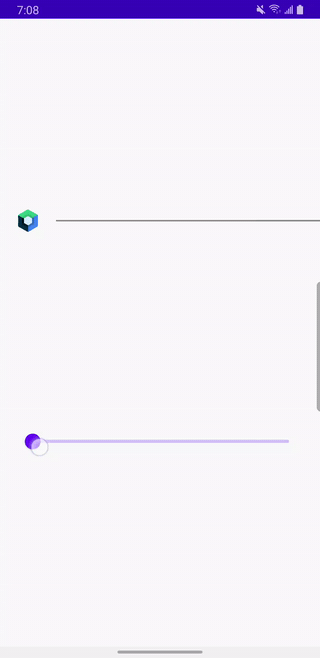
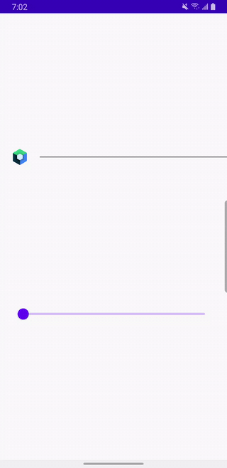
And here is the code. Note that we are not doing anything in the code to position the image vs the divider. All positioning is done in the motion scene JSON5 file using constraints.
        Image(
            painter = painterResource(
                id = R.drawable.jetpack_compose_icon
            ),
            contentDescription = stringResource(R.string.compose_icon_description),
            modifier = Modifier
                .layoutId("my_image")
        )
        Divider(
            color = Color.Gray,
            thickness = 2.dp,
            modifier = Modifier
                .layoutId("my_divider")
        )
    }
Now let’s make the logo go above the divider:
{
  ConstraintSets: {
    start: {
      my_image: {
        width: 40,
        height: 40,
        start: ['parent', 'start', 16]
      },
      my_divider: {
        start: ['my_image', 'end', 16],
        top: ['my_image', 'top'],
        bottom: ['my_image', 'bottom']
      }
    },
    end: {
      my_image: {
        width: 40,
        height: 40,
        end: ['parent', 'end', 16]
      },
      my_divider: {
        end: ['my_image', 'start', 16],
        top: ['my_image', 'top'],
        bottom: ['my_image', 'bottom']
      }
    }
  },
  Transitions: {
    default: {
      from: 'start',
      to: 'end',
      pathMotionArc: 'startHorizontal',
      KeyFrames: {
        KeyAttributes: [
          {
            target: ['my_image'],
            frames: [0, 50, 100],
            translationY: [0, -200, 0]
          }
        ]
      }
    }
  }
}
Note this part of the motion scene file:
  Transitions: {
    default: {
      from: 'start',
      to: 'end',
      pathMotionArc: 'startHorizontal',
      KeyFrames: {
        KeyAttributes: [
          {
            target: ['my_image'],
            frames: [0, 50, 100],
            translationY: [0, -200, 0]
          }
        ]
      }
    }
  }
It says that our image will go up and then down in a horizontal arc.
It will start with translationY equal to 0. Then half way through animation path is reached (50% of the animation path is done), translationY will be -200 pixels (negative translationY means moving towards the top of the screen). At that point, the image will be 200px above the divider. When the animation path is completed (last frame, 100% of the animation is done), the image will be back at the same level horizontally with translationY of 0.
Other transition key attributes available are:
alphavisibilityelevationrotation,rotationX,rotationYtranslationX,translationY,translationZscaleX,scaleY
Debug animation paths
The logo seems to touch the divider slightly. One way to confirm this would be by debugging this motion layout by showing the animation paths of all components involved. We can do this with the debug parameter. Note that by default the debug value is set to EnumSet.of(MotionLayoutDebugFlags.NONE).
MotionLayout(
    motionScene = MotionScene(motionSceneContent),
    progress = progress,
    modifier = Modifier
        .fillMaxWidth(),
    debug = EnumSet.of(MotionLayoutDebugFlags.SHOW_ALL)
)
The paths are denoted by a dotted line:
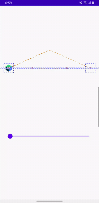
Our suspicion was correct—the logo touches the divider when starting and finishing it translationY transformation. One way to fix it, would be to play with the shape of the arc by giving the animation path extra frames and fine-tuning positions at those frames.
{
  ConstraintSets: {
    start: {
      my_image: {
        width: 40,
        height: 40,
        start: ['parent', 'start', 16]
      },
      my_divider: {
        start: ['my_image', 'end', 16],
        top: ['my_image', 'top'],
        bottom: ['my_image', 'bottom']
      }
    },
    end: {
      my_image: {
        width: 40,
        height: 40,
        end: ['parent', 'end', 16]
      },
      my_divider: {
        end: ['my_image', 'start', 16],
        top: ['my_image', 'top'],
        bottom: ['my_image', 'bottom']
      }
    }
  },
  Transitions: {
    default: {
      from: 'start',
      to: 'end',
      pathMotionArc: 'startHorizontal',
      KeyFrames: {
        KeyAttributes: [
          {
            target: ['my_image'],
            frames: [0, 5, 50, 95, 100],
            translationY: [0, -50, -200, -50, 0]
          }
        ]
      }
    }
  }
}
Scale the image
What if we wanted to change the scale of the image as it moves? There are scaleX and scaleY for that.
{
  ConstraintSets: {
    start: {
      my_image: {
        width: 40,
        height: 40,
        start: ['parent', 'start', 16]
      },
      my_divider: {
        start: ['my_image', 'end', 16],
        top: ['my_image', 'top'],
        bottom: ['my_image', 'bottom']
      }
    },
    end: {
      my_image: {
        width: 40,
        height: 40,
        end: ['parent', 'end', 16]
      },
      my_divider: {
        end: ['my_image', 'start', 16],
        top: ['my_image', 'top'],
        bottom: ['my_image', 'bottom']
      }
    }
  },
  Transitions: {
    default: {
      from: 'start',
      to: 'end',
      pathMotionArc: 'startHorizontal',
      KeyFrames: {
        KeyAttributes: [
          {
            target: ['my_image'],
            frames: [0, 50, 100],
            translationY: [0, -250, 0],
            scaleX: [1, 2, 1],
            scaleY: [1, 2, 1],
          }
        ]
      }
    }
  }
}
We would get the following:
Add a text
Let’s add a Text with id my_text to the mix:
{
  ConstraintSets: {
    start: {
      my_image: {
        width: 40,
        height: 40,
        start: ['parent', 'start', 16]
      },
      my_divider: {
        start: ['my_image', 'end', 16],
        top: ['my_image', 'top'],
        bottom: ['my_image', 'bottom']
      },
      my_text: {
        start: ['my_divider', 'start'],
        bottom: ['my_divider', 'top', 16],
      }
    },
    end: {
      my_image: {
        width: 40,
        height: 40,
        end: ['parent', 'end', 16]
      },
      my_divider: {
        end: ['my_image', 'start', 16],
        top: ['my_image', 'top'],
        bottom: ['my_image', 'bottom']
      },
      my_text: {
        end: ['my_divider', 'end'],
        top: ['my_divider', 'bottom', 16]
      }
    }
  },
  Transitions: {
    default: {
      from: 'start',
      to: 'end',
      pathMotionArc: 'startHorizontal',
      KeyFrames: {
        KeyAttributes: [
          {
            target: ['my_image'],
            frames: [0, 50, 100],
            translationY: [0, -250, 0],
            scaleX: [1, 2, 1],
            scaleY: [1, 2, 1],
          }
        ]
      }
    }
  }
}
And a Text composable:
    MotionLayout(
        motionScene = MotionScene(motionSceneContent),
        progress = progress,
        modifier = Modifier
            .fillMaxWidth()
    ) {
        Image(
            painter = painterResource(
                id = R.drawable.jetpack_compose_icon
            ),
            contentDescription = stringResource(R.string.compose_icon_description),
            modifier = Modifier
                .layoutId("my_image")
        )
        Divider(
            color = Color.Gray,
            thickness = 2.dp,
            modifier = Modifier
                .layoutId("my_divider")
        )
        Text(
            text = stringResource(R.string.text_compose),
            modifier = Modifier
                .layoutId("my_text")
        )
    }
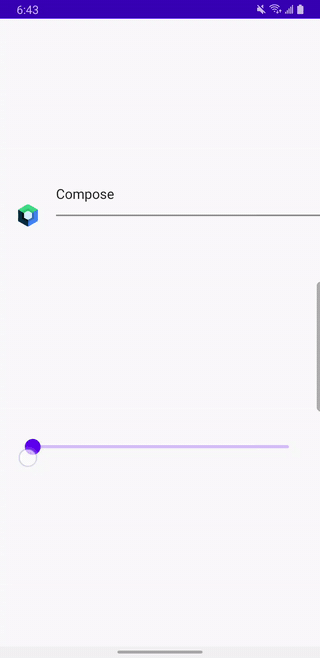
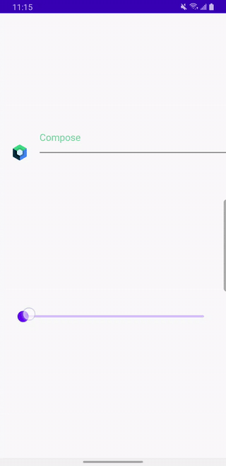
Which results in text “Compose” animating from top left to bottom right:
Animate text color
And let’s add color to the text and animate it from #71d88c to #5185ec. We can use custom motion property for that.
{
  ConstraintSets: {
    start: {
      my_image: {
        width: 40,
        height: 40,
        start: ['parent', 'start', 16]
      },
      my_divider: {
        start: ['my_image', 'end', 16],
        top: ['my_image', 'top'],
        bottom: ['my_image', 'bottom']
      },
      my_text: {
        start: ['my_divider', 'start'],
        bottom: ['my_divider', 'top', 16],
        custom: {
          textColor: '#71d88c'
        }
      }
    },
    end: {
      my_image: {
        width: 40,
        height: 40,
        end: ['parent', 'end', 16]
      },
      my_divider: {
        end: ['my_image', 'start', 16],
        top: ['my_image', 'top'],
        bottom: ['my_image', 'bottom']
      },
      my_text: {
        end: ['my_divider', 'end'],
        top: ['my_divider', 'bottom', 16],
        custom: {
          textColor: '#5185ec'
        }
      }
    }
  },
  Transitions: {
    default: {
      from: 'start',
      to: 'end',
      pathMotionArc: 'startHorizontal',
      KeyFrames: {
        KeyAttributes: [
          {
            target: ['my_image'],
            frames: [0, 50, 100],
            translationY: [0, -250, 0],
            scaleX: [1, 2, 1],
            scaleY: [1, 2, 1],
          }
        ]
      }
    }
  }
}
And here is the code:
MotionLayout(
        motionScene = MotionScene(motionSceneContent),
        progress = progress,
        modifier = Modifier
            .fillMaxWidth()
    ) {
        val properties = motionProperties(id = "my_text")

        Image(
            painter = painterResource(
                id = R.drawable.jetpack_compose_icon
            ),
            contentDescription = stringResource(R.string.compose_icon_description),
            modifier = Modifier
                .layoutId("my_image")
        )
        Divider(
            color = Color.Gray,
            thickness = 2.dp,
            modifier = Modifier
                .layoutId("my_divider")
        )
        Text(
            text = stringResource(R.string.text_compose),
            color = properties.value.color("textColor"),
            modifier = Modifier
                .layoutId("my_text")
        )
    }
And here is what it looks like in action:
Note that there is a limited subset of JSON5 attributes supported by Compose so far but that list is growing.
More info on Compose MotionLayout JSON syntax can be found here.
More examples of using MotionLayout in Compose can be found here.
The source code for this post can be found at https://github.com/jshvarts/MotionLayoutComposeDemo