Practical Compose Slot API example
May 31, 2022

Slot API pattern in Compose is a common pattern in Compose that offers “slots”— generic lambdas that accept composable content. There is a great post about it by Chris Banes at https://chris.banes.dev/slotting-in-with-compose-ui/.
Perhaps the most prominent example of this pattern is Scaffold. Scaffold provides slots for the most common top-level Material components, such as TopAppBar, BottomAppBar, FloatingActionButton, and Drawer. Its pluggable nature makes it easy to make sure these components are properly positioned and work together correctly.
@Composable
fun HomeScreen(/*...*/) {
    Scaffold(
        drawerContent = { /*...*/ },
        topBar = { /*...*/ },
        content = { /*...*/ }
    )
}
Building configurable parent layouts using content lambdas allows us to delegate each slot’s content to the caller and tends to offer future reuse and flexibility (it depends on your particular use case whether Slot API is the right choice for your needs).
Screen layout as a set of slots
In this post, we’ll look at another common example: laying out sections of a screen. The sections will have enough in common to use Slot API pattern to model the our HomeScreen as a set of HomeSection composables.
You can find the source code at https://github.com/jshvarts/ComposeSlotApiDemo.
Here is the UI we are building:

Chances are you have come across this design pattern before when building screens for Android—a screen is composed of several sections and their layouts follow a similar pattern. For instance, a section can have a title, content, sometimes description and action buttons, or something along those lines.
Here are the 3 sections that can be templated in the screen above:
Top Rated
Action
Animation
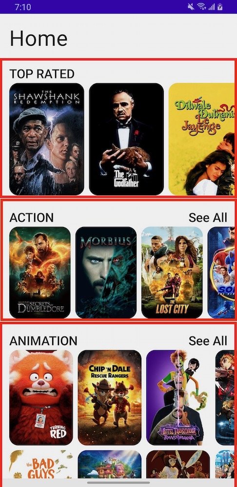
Each home section has a title and content and some of the sections have a See All button that lets you go to another screen with content filtered for that particular movie genre.
HomeSection slot
Let’s see how we can build such a Section slot:
@Composable
fun HomeSection(
  @StringRes title: Int,
  filter: SectionFilter? = null,
  modifier: Modifier = Modifier,
  content: @Composable () -> Unit
) {
  Column {
    if (filter == null) {
      SectionTitle(title = title)
    } else {
      Row(
        horizontalArrangement = Arrangement.SpaceBetween,
        modifier = modifier
          .fillMaxWidth()
      ) {
        SectionTitle(
          title = title,
          modifier = modifier
            .alignByBaseline()
        )
        SectionFilterButton(
          filterInfo = filterInfo,
          modifier = Modifier
            .alignByBaseline()
        )
      }
    }
    content()
  }
}
HomeSection is a slot that can hold a section of the home screen. It is defined as:
mandatory section title
optional filter (a way to build a “See All” button applicable to some sections only)
mandatory content lambda
Notice the composable content lambda. Slot API pattern takes advantage of the power of Kotlin to build flexible layouts—each section will lay out its data as according to its own unique needs.
Also notice that we modeled the filter info as follows:
data class SectionFilter(
  @StringRes val text: Int = R.string.section_filter_text_default,
  val onClick: () -> Unit
)
Note that the filter is modeled as a data class rather than separate
text: String?andonClick: (() -> Unit)?to avoid getting into an inconsistent state of a nulltextand non-nullonClicklambda and vice versa.
If filter is not applicable for a given section, null is passed in and we just render SectionTitle. Otherwise, we render a Row composable containing SectionTitle and SectionFilterButton composables.
As noted above, each of the 3 sections has a common overall structure but the UI for section content is slightly different and we allow for future flexibility.
Top Rated content is implemented as a
LazyRowto display movie posters with items larger than other in other sections.Action content is also implemented as a
LazyRowwith items smaller than those in the Top Rated section.Animation section uses
LazyHorizontalGrid. I just chose this arbitrary layout to demonstrate the flexibility we get with building sections in this modular way.
To review building lazy layouts with Compose, check out my other posts including Compose Row, Column and Scoped Modifiers, Lazy layouts contentPadding and Lazy Grid layouts in Compose.
HomeScreen layout
Setting up screen sections as slots gives you a blueprint for what this screen is about and makes it easier to work with it. If we have to add another section in the future, this code structure should make it pretty easy to do by adding an additional HomeSection block.
Here is our HomeScreen layout containing the screen title and utilizing the section slots defined above:
@Composable
fun HomeScreen(
  navController: NavController,
  modifier: Modifier = Modifier,
  homeViewModel: HomeViewModel = hiltViewModel()
) {
  val state by homeViewModel.uiState.collectAsState()

  if (state.isLoading) {
    LoadingIndicator()
  } else {
    Column(
      modifier
        .verticalScroll(
          rememberScrollState()
        )
    ) {
      Spacer(Modifier.height(16.dp))

      ScreenTitle(R.string.screen_title_home)

      HomeSection(title = R.string.section_title_top_rated) {
        TopRatedMovieList(state.topRatedMovies)
      }

      HomeSection(
        title = R.string.section_title_action,
        filter = SectionFilter {
          navController.navigate(Screen.ActionMovies.route)
        }
      ) {
        ActionMovieList(state.actionMovies)
      }

      HomeSection(
        title = R.string.section_title_animation,
        filter = SectionFilter {
          navController.navigate(Screen.AnimationMovies.route)
        }
      ) {
        AnimationMovieList(state.animationMovies)
      }

      Spacer(Modifier.height(16.dp))
    }
  }
}
Just by looking at the HomeScreen UI tree, it’s clear what sections it consists of and which components comprise the sections:
ScreenTitleHomeSectionfor Top Rated (no filter button). Delegates content building toTopRatedMovieListHomeSectionfor Action movies (with filter button). Delegates content building toActionMovieListHomeSectionfor Animation movies (with filter button). Delegates content building toAnimationMovieList
Delegating implementation detail to a component makes the code more self-documenting and adhere to single responsibility principles.
Also notice that we utilize state hoisting pattern to pass a list of movies to each section stateless component.
TopRatedMovieList
@Composable
fun TopRatedMovieList(movies: List<Movie>) {

  LazyRow(
    horizontalArrangement = Arrangement.spacedBy(8.dp),
    contentPadding = PaddingValues(
      start = 16.dp,
      end = 16.dp
    )
  ) {
    items(movies) { movie ->
      HomePosterImage(movie)
    }
  }
}
ActionMovieList
@Composable
fun ActionMovieList(movies: List<Movie>) {
  LazyRow(
    modifier = Modifier
      .height(160.dp),
    horizontalArrangement = Arrangement.spacedBy(8.dp),
    contentPadding = PaddingValues(
      start = 16.dp,
      end = 16.dp
    )
  ) {
    items(movies) { movie ->
      HomePosterImage(movie)
    }
  }
}
AnimationMovieList
@Composable
fun AnimationMovieList(movies: List<Movie>) {
  LazyHorizontalGrid(
    rows = GridCells.Fixed(2),
    horizontalArrangement = Arrangement.spacedBy(8.dp),
    verticalArrangement = Arrangement.spacedBy(8.dp),
    contentPadding = PaddingValues(
      start = 16.dp,
      end = 16.dp
    ),
    modifier = Modifier
      .height(340.dp)
  ) {
    items(movies) { movie ->
      HomePosterImage(movie)
    }
  }
}
Genre-filtered screens
Tapping on the See All filter button for a specific genre, opens a new screen that displays movies for that genre only. Here is an example of filtering Action movies only:
Again, full source code for this post at https://github.com/jshvarts/ComposeSlotApiDemo. Pagination was out of scope for this post but the code sample includes a good example of how some of these tie together:
Jetpack Compose
Jetpack Compose Navigation
Hilt for Dependency Injection
ViewModel using Coroutines and StateFlow
Retrofit with OkHttp and Moshi