Getting started with Canvas in Compose
April 4, 2022
There are a few Compose examples out there of drawing on Canvas in isolation or building complex UI with Canvas. The goal of this post is to do something in between: we’ll create a reusable Canvas component and explore basic concepts of drawing on it.
Hello, Canvas
The Canvas composable creates and manages a view-based Canvas under the hood. Unlike working with the view-based Canvas directly, you don’t have to worry about managing state and performance and dealing with a Paint helper object outside of onDraw(). Compose takes care of managing objects in an efficient way for you while giving you declarative Canvas API.
To get started, let’s make a Canvas composable first and put a blue rectangle on it using drawRect. Be sure to import androidx.compose.foundation.Canvas
class MainActivity : ComponentActivity() {
    override fun onCreate(savedInstanceState: Bundle?) {
        super.onCreate(savedInstanceState)
        setContent {
            CanvasDemoTheme {
                Canvas(
                    modifier = Modifier
                ) {
                    // access DrawScope here
                    drawRect(
                        color = Color.Blue,
                        size = size
                    )
                }
            }
        }
    }
}
Note that both modifier and onDraw lambda are required. Here is the framework code for the Canvas composable:
@Composable
fun Canvas(modifier: Modifier, onDraw: DrawScope.() -> Unit) =
    Spacer(modifier.drawBehind(onDraw))
This will produce a blank screen:
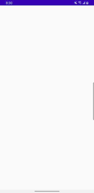
We don’t see our rectangle since Canvas composable has a zero size by default. And by setting rectangle size to canvas size we are just setting it to 0. You can confirm it by printing out size:
class MainActivity : ComponentActivity() {
    override fun onCreate(savedInstanceState: Bundle?) {
        super.onCreate(savedInstanceState)
        setContent {
            CanvasDemoTheme {
                Box(modifier = Modifier.fillMaxSize()) {
                    Canvas(
                        modifier = Modifier
                    ) {

                    // access DrawScope here
                    drawRect(
                        color = Color.Blue,
                        size = size
                    )

                    // prints Canvas size is Size(0.0, 0.0)
                    println("Canvas size is $size")
                }
            }
        }
    }
}
To change Canvas size, use Modifier.size or other size-related modifiers like width, height, fillMaxSize, etc. Let’s do that now:
class MainActivity : ComponentActivity() {
    override fun onCreate(savedInstanceState: Bundle?) {
        super.onCreate(savedInstanceState)
        setContent {
            CanvasDemoTheme {
                Canvas(
                    modifier = Modifier
                        .size(100.dp)
                ) {

                    // access DrawScope here
                    drawRect(
                        color = Color.Blue,
                        size = size
                    )

                    // prints Canvas size as DP 100.0.dp x 100.0.dp
                    println("Canvas size as DP ${size.toDpSize()}")
                }
            }
        }
    }
}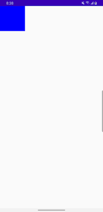
Now we are able to see the rectangle!
Since we are creating a custom component to be used by other composables, let’s build it in a reusable way.
We’ll start with wrapping our Canvas with another composable. The parent Box composable will control positioning of our Canvas on the screen:
class MainActivity : ComponentActivity() {
    override fun onCreate(savedInstanceState: Bundle?) {
        super.onCreate(savedInstanceState)
        setContent {
            CanvasDemoTheme {
                Box(
                    contentAlignment = Alignment.Center,
                    modifier = Modifier
                        .fillMaxSize()
                ) {
                    Canvas(
                        modifier = Modifier
                            .size(100.dp)
                    ) {
                        drawRect(
                            color = Color.Blue,
                            size = size
                        )
                    }
                }
            }
        }
    }
}
This placed our Canvas containing a blue square shape in the center of the screen.

Drawing behind a Composable
Before we design our component further, let’s discuss an alternative to using a Canvas composable.
Instead of creating a Canvas composable directly, we can draw behind any composable by accessing its DrawScope using Modifier.drawBehind.
Let’s do that and implement our custom component as a Box composable that draws blue rectangle behind it. The outer Box is simply used to position our component in the center of the screen like before.
class MainActivity : ComponentActivity() {
    override fun onCreate(savedInstanceState: Bundle?) {
        super.onCreate(savedInstanceState)
        setContent {
            CanvasDemoTheme {
                Box(
                    contentAlignment = Alignment.Center,
                    modifier = Modifier
                        .fillMaxSize()
                ) {
                    Box(
                        modifier = Modifier
                            .size(100.dp)
                            .drawBehind {
                                drawRect(
                                    color = Color.Blue,
                                    size = size
                                )
                            }
                    )
                }
            }
        }
    }
}
This will produce the same UI as above but now we are drawing behind a composable rather than creating a Canvas directly.
By using .drawBehind you gain access to DrawScope. When would you choose one vs the other? My understanding is you would use drawBehind if you have a complex composable or a composable that was already built and you just need to draw something on a Canvas behind it. Also, drawText was available in the view-based Canvas but not in Compose. But you can easily combine a Text composable with a drawBehind modifier to achieve the same thing.
In other cases, starting at with a Canvas directly probably makes more sense.
So far so good. Let’s make our Canvas a re-usable component.
Making a reusable component
I recommend placing our component composable, preview composable and helper functions it depends on into a separate file, perhaps inside a components package or something similar.
Let’s get started with our custom component.
@Composable
fun SquareComponent(componentSize: Dp = 300.dp) {
    Canvas(
        modifier = Modifier
            .size(componentSize)
    ) {
        drawRect(
            color = Color.Blue,
            size = size
        )
    }
}
Now we can compose our component by supplying a desired componentSize or using a default parameter of 300.dp
While all size- and position-related settings in Canvas are controlled in pixels using Float, it makes sense for the composable creating this component to pass in parameters as dp (density independent pixel). The calling composables should not need to know that the component is using Canvas.
class MainActivity : ComponentActivity() {
override fun onCreate(savedInstanceState: Bundle?) {
super.onCreate(savedInstanceState)
setContent {
CanvasDemoTheme {
Box(
contentAlignment = Alignment.Center,
modifier = Modifier
.fillMaxSize()
) {
SquareComponent(componentSize = 100.dp)
}
}
}
}
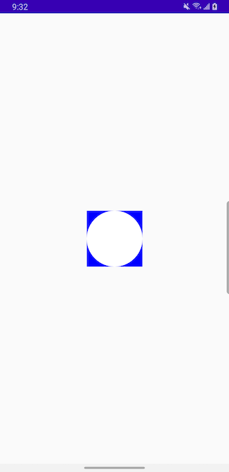
}Let’s imagine that our component evolves and a single square does not surfice anymore—let’s add a circle and place inside the square.
@Composable
fun SquareComponent(componentSize: Dp = 300.dp) {
Canvas(
modifier = Modifier
.size(componentSize)
) {
// draw a square the size of our canvas
drawRect(
color = Color.Blue,
size = size
)
// place circle on top of square
drawCircle(
color = Color.White,
center = Offset(x = size.width / 2f, y = size.height / 2f),
radius = size.minDimension / 2f
)
}
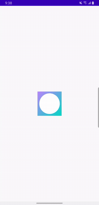
}Which will produce the following UI:
Placement and coordinates
When calculating center of our circle, we had to do some calculations. By default, the start of any shape on your canvas is X=0, Y=0 coordinates located in the top-left corner of your canvas. To adjust your starting point, you can overwrite topLeft of the shape you are drawing. We’ll show an example later.
Each of the drawing functions such as drawRect and drawCircle have reasonable defaults accomplished by default parameters. For instance, by default drawRect fills its entire parent scope. By default, drawCircle draws a filled circle and has a radius equals to half of its parent’s shorter dimension.
Here is the code from androidx.compose.ui.graphics.drawscope with defaults for drawRect:
fun drawRect(
    brush: Brush,
    topLeft: Offset = Offset.Zero,
    size: Size = this.size.offsetSize(topLeft),
    /*FloatRange(from = 0.0, to = 1.0)*/
    alpha: Float = 1.0f,
    style: DrawStyle = Fill,
    colorFilter: ColorFilter? = null,
    blendMode: BlendMode = DefaultBlendMode
)
And code from androidx.compose.ui.graphics.drawscope with defaults for drawCircle:
fun drawCircle(
    brush: Brush,
    radius: Float = size.minDimension / 2.0f,
    center: Offset = this.center,
    /*@FloatRange(from = 0.0, to = 1.0)*/
    alpha: Float = 1.0f,
    style: DrawStyle = Fill,
    colorFilter: ColorFilter? = null,
    blendMode: BlendMode = DefaultBlendMode
)
Adding some animation
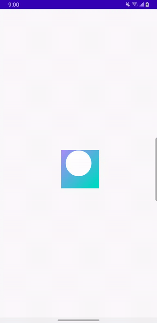
So far so good. Let’s add some flare to this new component by 1) adding a gradient color to the box and 2) animating the circle with a scale animation.
@Composable
fun SquareComponent(componentSize: Dp = 300.dp) {
    val canvasSizePx = with(LocalDensity.current) {
        componentSize.toPx()
    }

    val infiniteScale = rememberInfiniteTransition()

    val animatedDotScale by infiniteScale.animateFloat(
        initialValue = 20f,
        targetValue = canvasSizePx / 2,
        animationSpec = infiniteRepeatable(
            animation = tween(
                durationMillis = 1000,
                easing = FastOutLinearInEasing
            ),
            repeatMode = RepeatMode.Reverse
        )
    )

    Canvas(
        modifier = Modifier
            .size(componentSize)
    ) {
        drawRect(
            brush = Brush.linearGradient(
                colors = listOf(Purple200, Teal200)
            ),
            size = size
        )

        drawCircle(
            color = Color.White,
            center = Offset(x = size.width / 2f, y = size.height / 2f),
            radius = animatedDotScale
        )
    }
}
Which will produce the following:
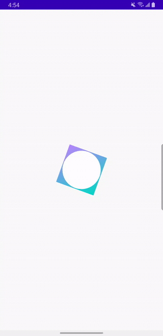
You can easily apply transformations to shapes on canvas by wrapping them into rotate, translate, scale, and more. For instance, here is our square rotated by 20 degrees. This used to be much harder to do pre-Compose using the View system.
rotate(degrees = 20f) {
    drawRect(
        brush = Brush.linearGradient(
            colors = listOf(Purple200, Teal200)
        ),
        size = size
    )
}
Which will result in the following UI:
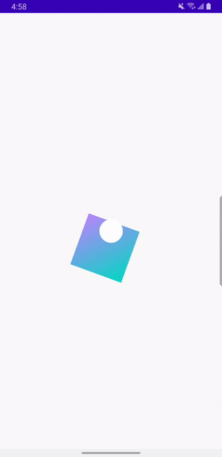
We can also apply a translate transformation to this rectangle by nesting it inside your rotate transformation. This will rotate the rectangle by 20 degrees and push it towards the bottom at the same time.
rotate(degrees = 20f) {
    translate(top = size.width / 3f) {
        drawRect(
            brush = Brush.linearGradient(
                colors = listOf(Purple200, Teal200)
            ),
            size = size
        )
    }
}
By nesting the transformations that way, you make user’s device work harder than it needs to as it needs to execute both transformations in parallel. A better approach would be to use withTransform function which will calculate and apply a single transformation to your shape:
withTransform({
    rotate(degrees = 20f)
    translate(top = size.width / 3f)
}) {
    drawRect(
        brush = Brush.linearGradient(
            colors = listOf(Purple200, Teal200)
        ),
        topLeft = Offset(10f, 40f),
        size = size
    )
}
Cleaner code with DrawScope
Great progress so far! In a real world app, this component will do a lot more and likely have much more code. If we wanted to make it more modular, we can extract some of the steps done in onDraw into helper extension functions scoped to DrawScope. It will better organize our code but not change the resulting UI.
@Composable
fun SquareComponent(componentSize: Dp = 300.dp) {
    Canvas(
        modifier = Modifier
            .size(componentSize)
    ) {
        myBox()
        myPulsatingDot(dotScaleAnimation)
    }
}

fun DrawScope.myBox() {
    drawRect(
        brush = Brush.linearGradient(
            colors = listOf(Purple200, Teal200)
        ),
        size = size
    )
}

fun DrawScope.myPulsatingDot(
    dotScaleAnimation: Float
) {
    drawCircle(
        color = Color.White,
        center = Offset(x = size.width / 2f, y = size.height / 2f),
        radius = dotScaleAnimation
    )
}
Note that now our drawRect and drawCircle functions are extracted into myBox() and myPulsatingDot() respectively. They are scoped to DrawScope so they have access to Canvas functionality and its properties such as size. While it seems like an overkill in this scenario, this should pay off in the future when the component evolves and grows.
Customizing topLeft
As mentioned above, topLeft will let you specify the starting point for your shape coordinates. It works with most shapes and takes an Offset as a parameter which lets you specify X and Y coordinates. Example below shifts the default topLeft: Offset = Offset.Zero (coordinates X=0, Y=0) to the left and 40px to the bottom.
As a reminder, in Android, positive X values move you along the X axis to the right and positive Y values move you along the Y axis downwards.
fun DrawScope.myBox() {
    drawRect(
        brush = Brush.linearGradient(
            colors = listOf(Purple200, Teal200)
        ),
        topLeft = Offset(10f, 40f),
        size = size
    )
}
That’s it for now. Here is a great overview of other draw* functions provided by Canvas.
As always, you can get the source code for this post here.